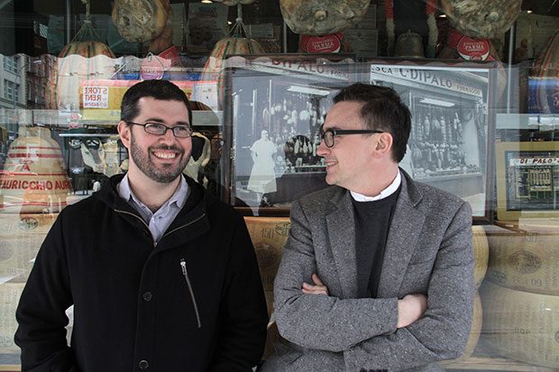
Commercial Type is a New York-based type foundry set up by Christian Schwartz and Paul Barnes in 2004. They have designed fonts for an international array of clients including Vanity Fair, Wallpaper* and The Guardian.
On the questions that need asking straight away... Before starting any new project, we make sure the client’s problem can’t be solved by an existing typeface, and we try to make sure any new client has a genuine interest in what we do. Excitement about how a new typeface is one of the building blocks of a publication or corporate identity.
On the other hand when the primary aim of a typeface design project is to get around licensing issues — rather than solving a typographic problem — red flags go up. If the client starts by telling us: “We really want to use this existing typeface [often Helvetica], but we want it to be ownable,” chances are slim that anyone is going to wind up happy in the end.
Why type clients are different... Clients for typeface design tend to be designers themselves who are looking for a tool to help them solve specific design problems. Clients come to us because we have a particular expertise that can furnish them with the appropriate tool. After all, a typeface isn’t really anything until it’s being used. This has good and bad aspects to it, as a new client may sometimes be over-specific in their references, trying to impress us with how knowledgeable they are about type, but once we’ve all settled on a common vocabulary it tends to go smoothly.
Typefaces are also different from the average graphic design project in that once we’ve agreed on a solution, the client usually has to turn around and convince someone else (like a managing editor or a marketing director) that the project is worth doing, without us being there to help.
What they’ve learned from more challenging clients... In the early stages of sketching, we always try to work with a real headline (or tagline, for a corporate project), so our client can try out the various options in real layouts, ensuring a good fit. When projects have gone wrong, we often find when we look back that we and the client didn’t spend enough time looking at layouts in the beginning before rushing on to finish the typeface.
Why it’s not worth getting stressed by a lower case g... I don’t recall ever truly arguing with a client. Everyone needs to feel like they’re being heard, and some clients care a lot about having hands-on involvement in the design of the typeface, which we try to accommodate as best as we can. For example, one editor sketched an italic z during a meeting, and we figured out how to use that structure across all of the weights.
We have to pick our battles carefully, because a typeface is made up of many moving parts, and it’s exponentially more complicated the larger the range of weights and widths. There’s no sense in wearing ourselves out arguing over one lowercase g. It’s better just to draw three or four options we can live with and let the client pick one.
